How to Create the Best Ad Creative
The practical tactics for the best ad experience
What if I told you that Vungle knows the secret to create the best ad creative for mobile apps and mobile games?
Or what if I told you a famous global mobile app or game company knows the same secret?
Over 15,000 new creatives are uploaded on our network per month on average. Every day while working for the Vungle Creative Labs team, I analyze creative performance on the Vungle network, generating hypotheses based on my findings. I then use these discoveries to produce, test, and iterate on new ad creatives.
In this article for the Vungle blog, I share a hypothesis on how to create the best ad creatives based on my latest research.
What’s the worst kind of ad experience?
Here’s what I often hear from mobile marketers:
- “We’ve produced a lot of video ads, but none of them have scaled.”
- “We’ve produced costly creative, but it didn’t generate ROAS.”
- “We applied a trendy creative style, but it didn’t work.”
Indeed these are results that marketers want to avoid. But what about from the user’s perspective? The user doesn’t know that there are many ad creatives out there. They don’t know how much creative design costs. They don’t know if an ad creative is leveraging a trendy creative style or not.
So what’s the worst kind of ad experience for users?
An ad experience that doesn’t interest users from the start and simply takes up their time. Since they’re not interested, they don’t want to learn more about the advertised app’s content. As a result, they won’t click on the ad or install the advertised app. This is the worst possible sequence of events for the user and advertiser alike.
So how can this be avoided?
This is where the power of creating compelling creatives comes into play.
Guide the users to the ideal state
The ideal user flow for an ad creative goes like this: First, get users interested. Then get them to engage with the app’s ad creative content and, as a result, guide them to take action, such as installing the app.
So how do you build the ideal user flow for an ad creative? We need to guide the user into four states:
- Relate
- Concentrate
- On board
- Excited

By guiding users through these four ideal states, you have a better chance of influencing their behaviors to achieve your desired results.
So what further steps are needed to lead users through these four ideal states? Below, I break down each user state into greater detail.
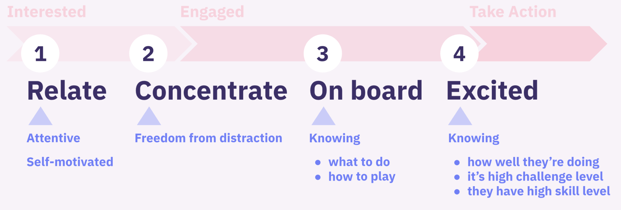
- To make the ad experience relevant to users, get them to pay attention and become self-motivated.
- To make them concentrate, create an environment where they will not be disturbed.
- To get them on board, make sure they understand what they’re doing and how they’re doing it.
- To get them excited, make sure they understand how well they are doing, challenging themselves to a high level, and highly skilled.
The excited user state may be a little difficult to understand. Think back to a time when you were absorbed in a game. When you are so absorbed in a game that you lose track of time. You may intuitively understand how well or poorly you are doing in the game. You may also be challenging yourself with a high skill level and a high challenge level.
1. Relate
Ideal user state: Attentive
First, you need to draw attention to your ads to get people to relate to the advertised app itself.
One way to do this is to catch the user’s eye with relevant content.
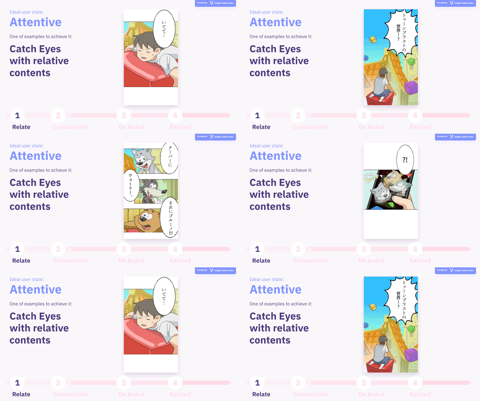
In this example above from puzzle game Toon Blast, Peak localized the style of this ad creative for the Japan market, designing it in a manga style familiar to Japanese culture to increase engagement.
In other instances, you can catch the user’s attention by adding a Halloween or Christmas theme to match the season. If China is your target market, you could also design ads that coincide with Chinese New Year.
If you just want to catch the user’s attention, you can use live-action videos, photos, or famous celebrities and influencers. You can also display nebulous messages at the top of the screen such as “If you can get to pink, you are a legal professional.”
Ideal user state: Self-motivated
The second state to get users to associate with your app’s ad creative is to make them self-motivated. Give them an incentive to watch the ad voluntarily.
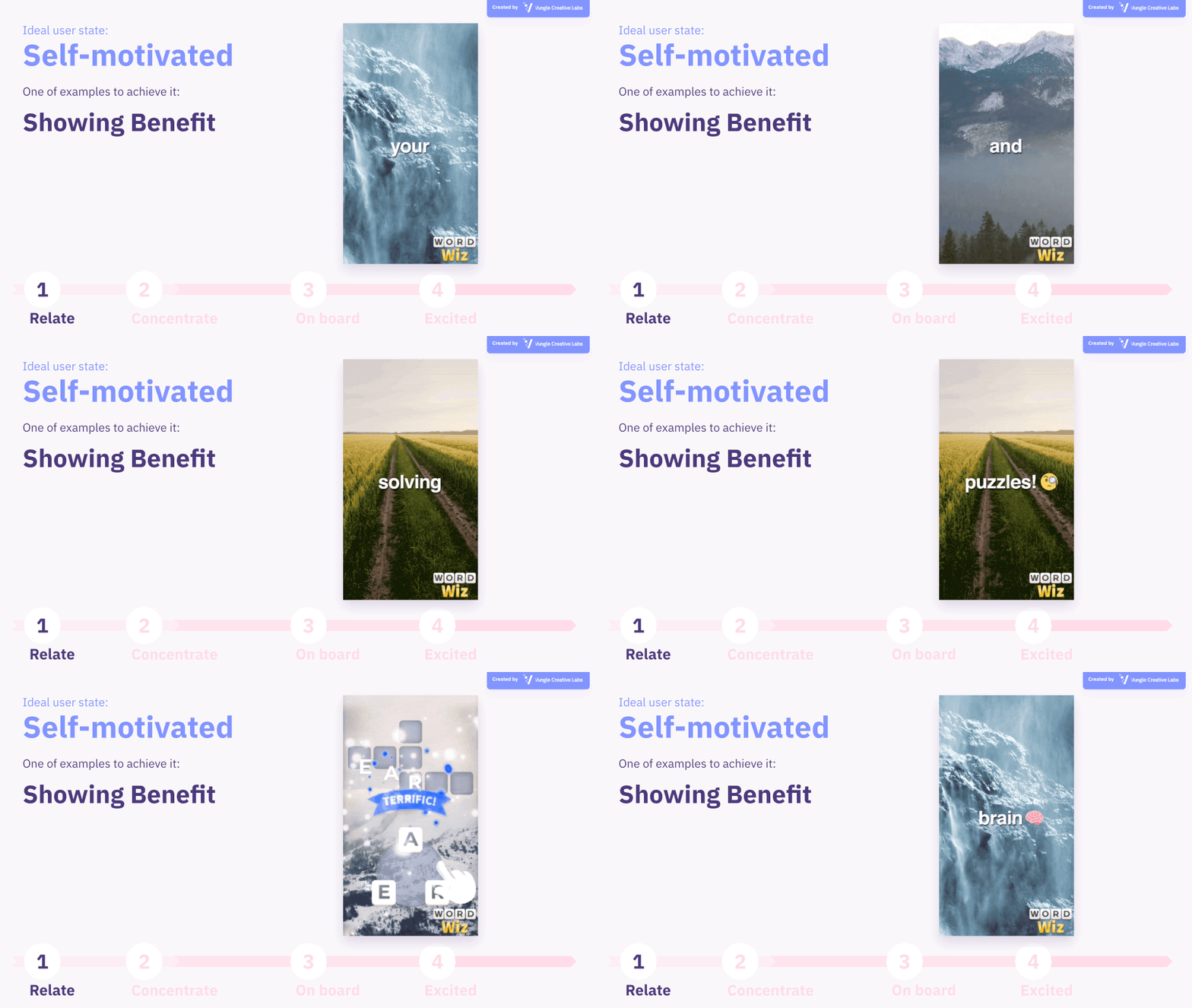
In this example above, the message, “Solve puzzles and improve your vocabulary”, explicitly describes the benefits of playing this game. In this way, users who may have a small vocabulary will voluntarily try to understand the ad’s content. The same tactic might work for a welcome bonus in a casino game or a first-time coupon in a food delivery app.
Another way to make users self-motivated: Appeal to a user’s human emotion. In the past couple of years, advertisers ran ad creatives where users were tasked with solving puzzles to help a game character in peril. It may also be useful to present high app store review scores or the total number of app store downloads as social proof. If the style of the app or game itself is novel, it may in itself make the user self-motivated.
2. Concentrate
Ideal user state: Freedom from distraction
Once you’ve gotten users relating to your app in the previous step, now we need to keep them concentrated. To do this, you need to create an environment where the user isn’t disturbed by unnecessary noise.
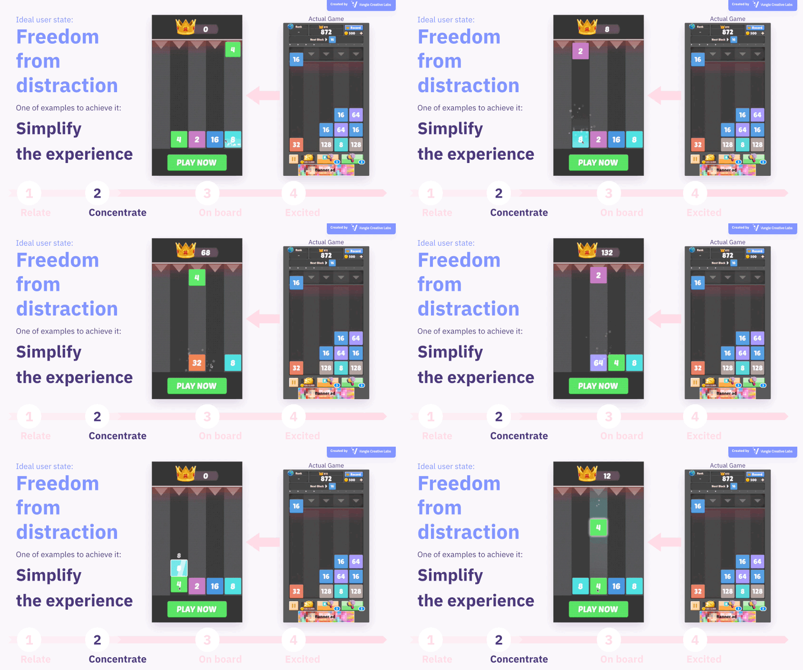
For example, simplify the app screen. Typically, the device screen has the UI for operation prominently displayed in the game for easy understanding. Most game UI, though, isn’t necessary to convey in an ad creative. Since the ads are displayed on the actual device screen, users may accidentally tap on them.
In this example above from Superbox’s Drop The Number, we removed the unnecessary UI elements and made each gameplay element bigger.
If it’s difficult to remove the UI, or if you want to include the UI, you may want to highlight only the elements you want to focus on.
3. On board
Ideal user state: Knowing what to do
Only when you lead the user to this point can you engage the user with the app’s content itself.
A mobile ad is a virtual experience, so to speak, where the user experiences the ad on the screen where they will potentially use the advertiser app. To engage the user while experiencing an ad, you first need to make them understand what they need to do.
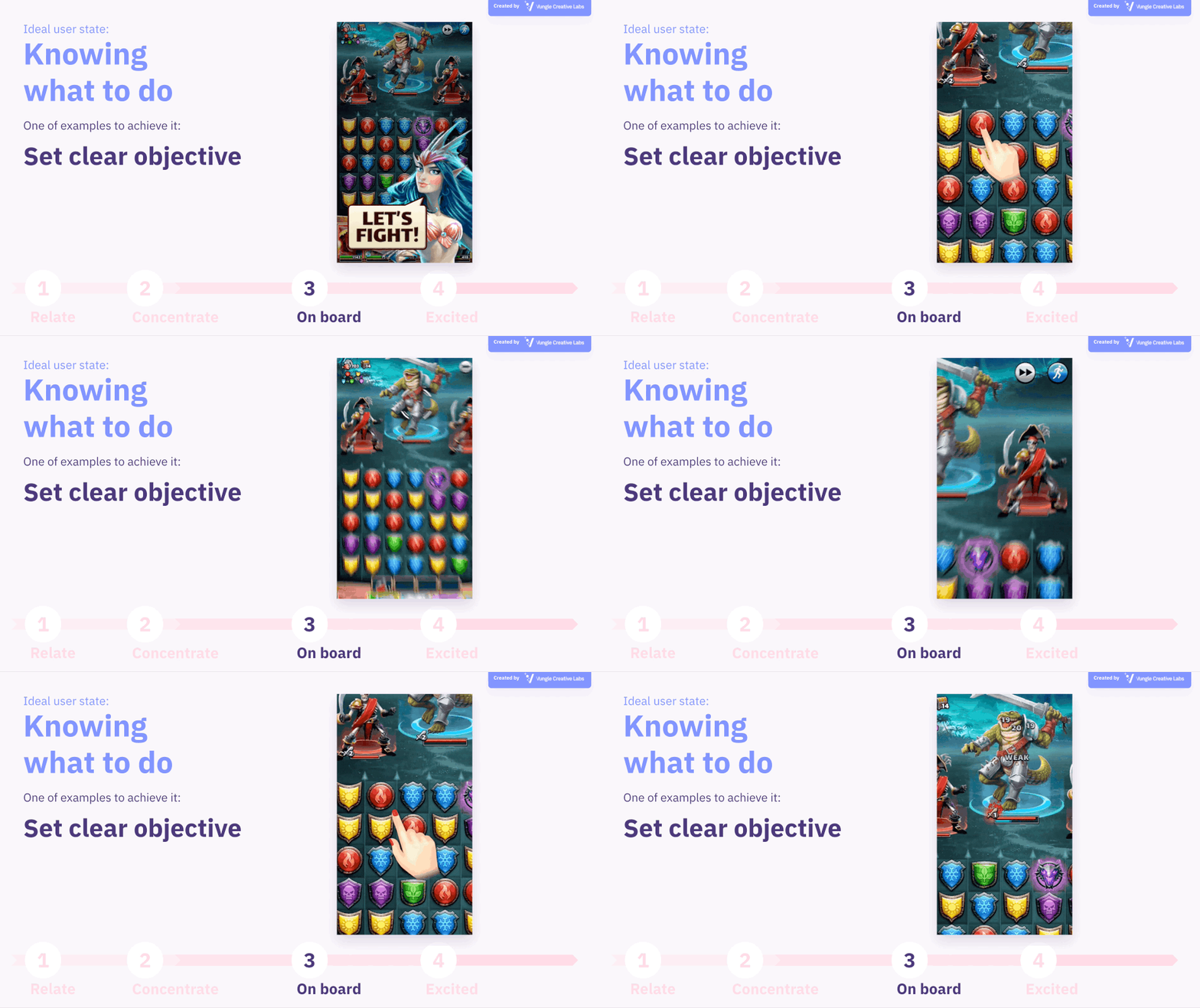
In this example above from puzzle game Empires & Allies from developer Small Giant Games, the ultimate goal for the user isn’t to solve the puzzle but to defeat the enemies on the stage. The objective is made known to the user through on-screen text and a camera zoom effect.
Ideal user state: Knowing how to play
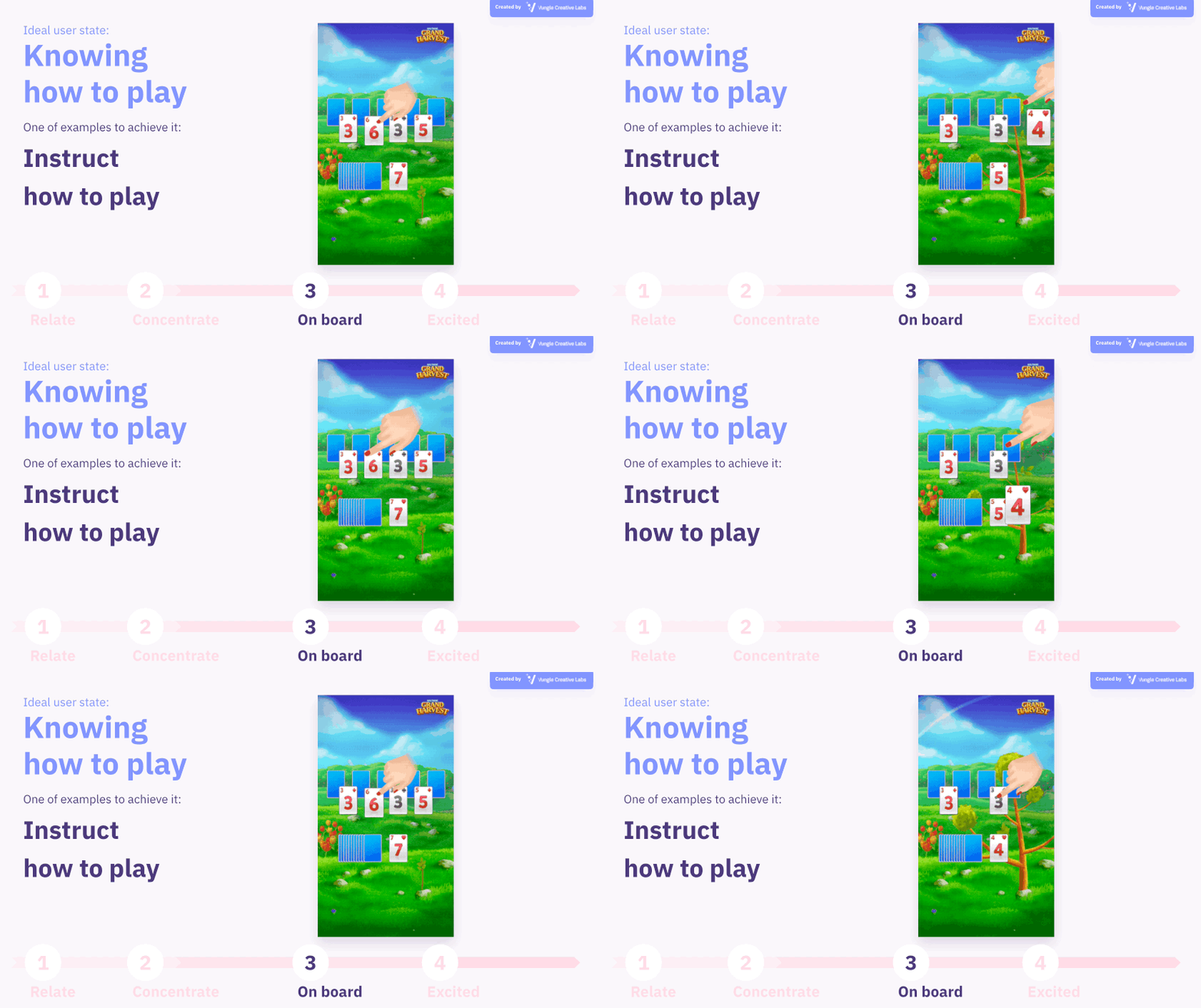
Even if users understand the objective of a game, you need to make sure that they know how to achieve them. The easiest way to do this is to use hand illustrations demonstrating the touch controls to play the game. Apps with relatively simple visuals, such as hyper-casual games, may not even need to utilize hand illustrations to demonstrate game controls.
In addition to hand illustrations, other useful tools to demonstrate game controls include audio and subtitles.
4. Excited
Ideal user state: Knowing how well they’re doing
To excite users, you need to make them know how well or how poorly they’re doing.
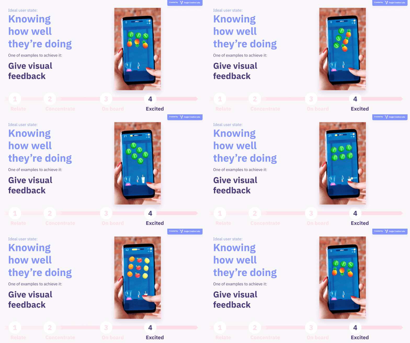
One of the easiest ways to do this is to give visual feedback. In this example above from Ketchapp’s Fruit Master, a live-action recording of actual gameplay has been edited, and Vungle Creative Labs added a bursting fruit particles animation. By adding such visual feedback, the user can intuitively understand whether they have just done well or failed.
For a puzzle game ad, it might be useful to show a significant increase in score, a text callout such as “Nice!”, or an IQ gauge. Alternatively, you could include a game character’s reactions or a real person expressing surprise or delight.
The recent trend of metagames that display completely different minigames, such as coloring images and the actual gameplay, is another example. Metagames are used in ads for core games where it’s difficult to understand the criteria for success or failure in the actual core game.
Ideal user state: Knowing it’s a high challenge level
There’s nothing more satisfying than completing a highly challenging level. However, the most challenging levels vary by user, making it difficult to present visually in an ad creative.
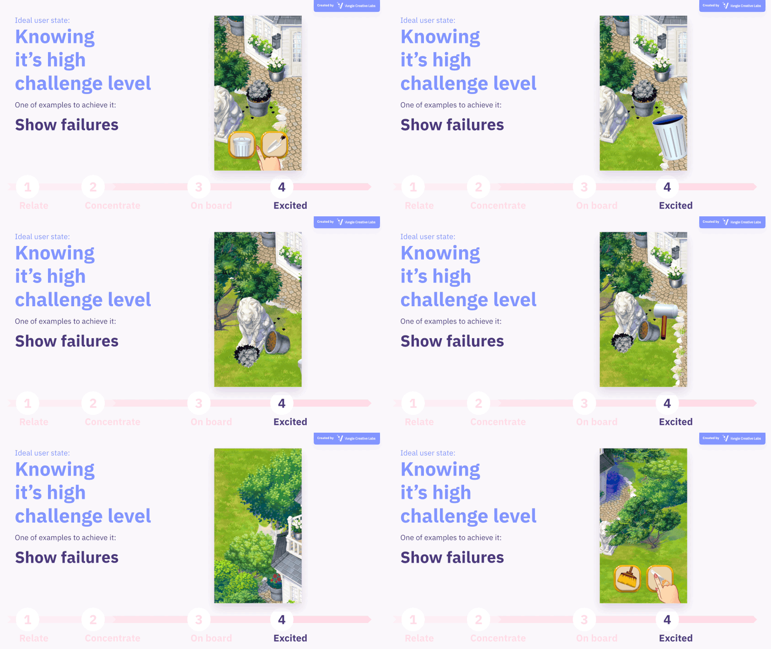
In these instances, an effective way is to show failure in an ad. By showing the failure states in the game ad, you can first demonstrate the purpose of the game clearer. By showing these failure states, you give the user room to think of a better solution. This method will make the user feel, “Oh, I wish I could do that” or “I can do that,” which is achievable for them but not in the ad. In other words, you can make users understand that they have the high skill to complete a high level.
Sensationalized on-screen statements such as “Only 1% of people can complete this” or “Only people with IQ over 150 can complete this” in puzzle games may also be effective.
Ideal user state: Knowing they have a high skill level
Finally, to excite users, we need to make them understand that they have the skills to play the advertised app well.
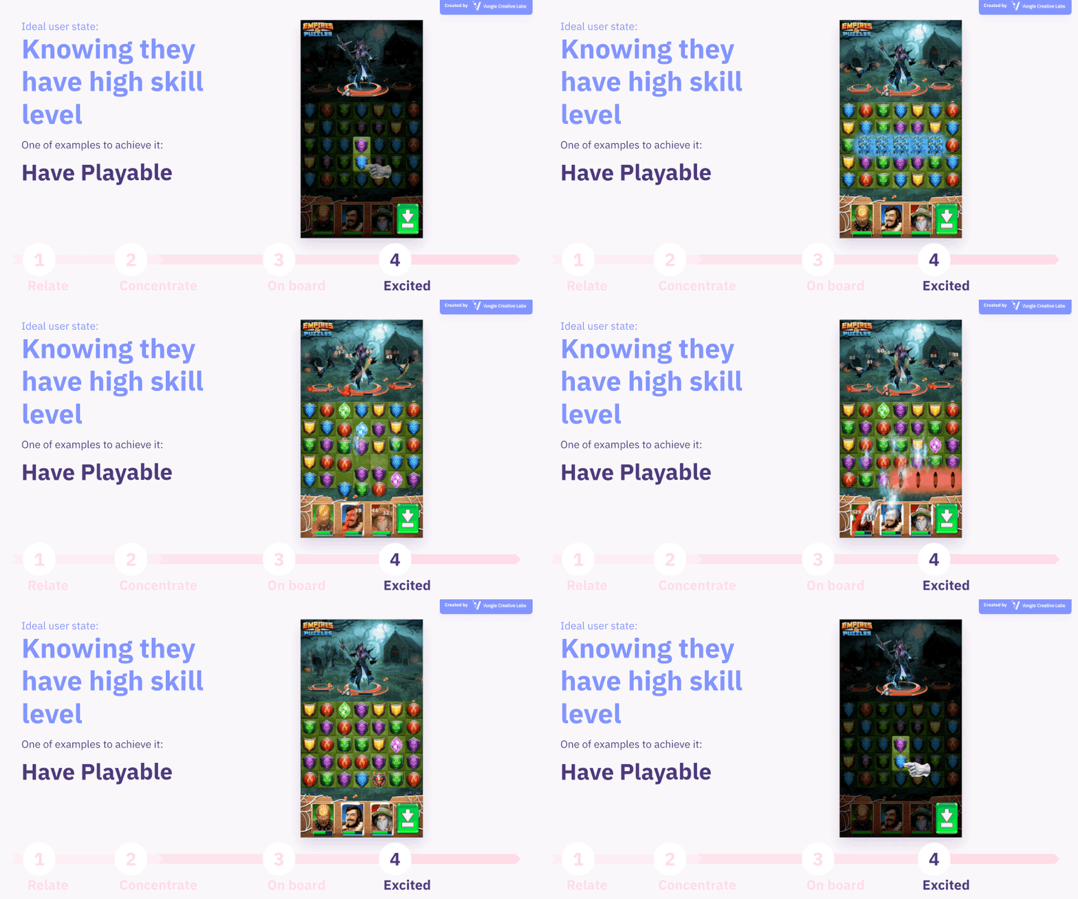
The best way to do this is to use playable ads and let the users play the game. The playable experience is like on-the-job training, so to speak, allowing users to test their skills and discover the app’s fun content at their own pace.
Also Read: Playable Ads – Drive Revenue & Retention Through the Power of Interactivity
The methods I’ve illustrated so far are also useful within a playable ad alone. It’s even more effective if you show a playable end card after a video ad impression, so the user has an even better understanding of the app or game.
One more tip
If you can guide users through these states with your ad creative, they will be engaged and interested in your app and will install. We encourage you to try the tactics we’ve introduced in this article. But don’t limit yourself to the tactics described here. Test to find out the best tactics for creating the most compelling ad creatives for your app or game.
Last but not least, don’t forget about putting a CTA in your ad creative. Make sure you have a “download” button in your video ad or end card so that users know the explicit intent of the ad.
At Vungle Creative Labs, we do everything but design uninspiring ad creative. We support our customers with the latest creative trends, tailored creative, and analysis. If you’re interested in any of the information presented in this article, please contact us at [email protected].