How to Make the Most of the Humble Banner Ad
Sam Knowles, Customer Success Manager at Liftoff, takes a look at what the best mobile banner ads do differently, along with some creative banner ad examples designed to maximize this often-underutilized ad format.
Getting the right creative in front of your audience is the most fundamental step in getting the results you need. A study, Creativity in Advertising, found that every “euro invested in a highly creative ad campaign had, on average, nearly double the sales impact of a euro spent on a non-creative campaign.” It’s essential for ads to surprise and delight viewers to capture their attention.
Creative advertising also makes your marketing more efficient. Why waste effort collating data and refining your target audience to deliver a mismatched creative? Instead, marketers and designers must invest their time in building the best creatives possible.
Marketers have to make a large number of choices when deciding on which kinds of ads to run. But there are natural limiting factors that make our ad of choice—banner ads—appealing. Banner ads are comparatively easy to make, cheap to run, and are usually a natural first choice when creating ads for a new app.
But how can you make better banner ads that can compete with video ads filled with captivating gameplay, interstitials with eye-catching visuals, or even large native placements with high-resolution images of the week’s best-selling products? There are several ways to make banners effective, but you have to read on to find out.
What is a Mobile Banner Ad?
A mobile banner ad is an ad unit that can display text, pictures, or animated objects designed to attract attention. They appear when the user starts a session and stay active while the session runs. Banner ads are usually rectangular, though there are other sizes marketers can explore.
Banner advertising is popular on mobile because banner ads are simple to make, easy to implement, and effective at driving awareness of the brand, as well as impressions for advertisers. Mobile banners also make good use of relatively small screen space.
What Sizes and Varieties of Mobile Banner Ads?
There’s more than one size (meaning shape, not file size) of mobile banners you can choose. Each performs well at different tasks. Let’s cover the bases of the main banner sizes:
Standard banner (320 x 50)
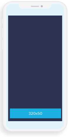
Standard-sized banners are the smallest and most common of all. They are usually displayed at the top or bottom of an app.
Bear in mind, if your ads are served on devices with retina displays, you need double the size (640×100) to ensure the best quality. This ‘doubling up’ affects all sizes.
Half-interstitial (300 x 250)
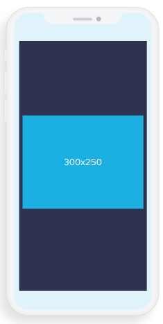
A half-interstitial appears in the middle of the screen. They show up most often when a user scrolls through a feed. Due to their larger size, it’s easier to fit more information while making the ad appealing. They are less intrusive on a user’s viewing time.
Interstitial (320 x 480 or 480 x 320)
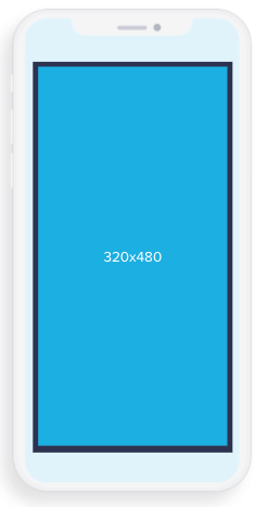
Interstitials take up the entire screen, and they are a good size for testing out variable changes or displaying even more complex interactives due to more available space.
Out of all three, this blog focuses on standard banners—the most common ad an app user will see. If you’d like more information on specific ad creative guidelines, the Interactive Advertising Bureau (IAB) has created standards you can follow.
How Effective are Banner Ads?
Data compiled by Liftoff between Q4 2018 and Q4 2019 revealed that banner placements delivered the highest Install-to-Action rate (24%) for mid-funnel in-app actions when compared to all other formats. Compared to the relative expense for video or interstitial placements, it makes sense to give your smaller format more thought.
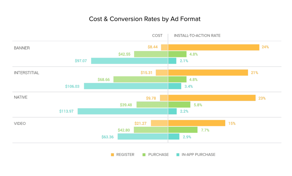
The 320×50 banner ad is highly versatile and non-intrusive. There is also a range of less tangible but equally powerful benefits, such as:
- The cost of placement is low and the volume of impressions is high.
- Standard banners can be altered and tested far faster than your average VAST creative, among other competing ad formats.
- You can run smaller test iterations rapidly when looking for that % uplift.
- Learnings from quick tests can be applied to your other formats, improving overall campaign performance.
Not convinced? A study by Google Media Lab found that cross-screen banner ads drive brand lift.
3 Banner Ad Best Practices
So what makes a more-successful banner ad? To analyze the elements of what makes an effective ad, we’ve run countless (50,000+) tests across hundreds of top- and bottom-performing ads in all verticals to identify patterns that were successful at driving installs. Through our analysis, we discovered three key creative levers worth considering to reach potential users.
The Best Banner Ads Keep it Simple
It’s tempting to deploy all of the colorful graphics you’re using elsewhere, but try to avoid them. Full-bleed creatives scaled down to this small size look overcomplicated and messy, reducing click and install rates. Testing shows that simpler options almost always outperform these sorts of banners. Using only your app’s logo, title, and some copy, you can quickly create a simple banner with a much stronger call to action.

Icons or Character Layers Highlight Your USPs
Consider some innovative ways to feature the unique selling proposition of your app user experience into a banner ad format. Animating elements such as game icons, characters, or popular products in a scrolling carousel all create significant uplift in banner performance.

Use Compelling Data
If your app is centered around delivering a service, banners offer a simple way to broadcast your successes. Take Teltech’s spam call counter, which beat out other versions with a 101% CTI lift.

Scaling back on graphics leaves more room to test out your copy—an area you should always focus on. Using banners to regularly test short and medium-length copy options allow you to share wins across all creative assets more frequently.
Do’s and Don’ts
Banner ads need to strike a balance between getting a user’s attention and ensuring they don’t interrupt their experience, but what other simple do’s and dont’s can you apply to banner ad creation?
Use High-Quality Images
Images are critical for getting ads to perform well. For the best results, avoid any images that are blurry, upside-down, unclear, include a border, or excessively filtered.
Avoid Overlays
Overlays can skew your banner ads, confusing users with what’s on offer. Logos should stand out and away from the image. And overlaid text can be unreadable in smaller ad sizes.
You might want to try experimenting with buttons that don’t add functionality to encourage click-through. Our advice? Don’t.
Perfect Your Copy
Banner ads on mobile make use of too much text challenging to pull off. Your copy must be short and snappy. Create a clear message with enough text to generate curiosity, but don’t go overboard.
Try keeping it clean, simple and focus on testing out those small variations that can still make all the difference. Your 320×50 banners could become your secret weapon to creative testing!
Taking Your Banner Ads Further
There’s no perfect recipe for a successful banner ad, but these best practices should help guide your thinking when you’re creating your next campaign. As Pablo Picasso once said, “Learn the rules like a pro so that you can break them like an artist.”
Banner ads shouldn’t be underestimated. Strengthening the quality of your ads requires hard work and investment, but good creative brings dramatic results. Keep your ads clean, simple and focus on testing out small variations that could make all the difference.
We’ve released our updated 2021 edition of Liftoff’s Ad Creatives Index, which you can download for free today to learn more about all types of creative formats. Discover how each creative performs and how you can improve banners, playable and native ads, among others. You can also read up on how to optimize video campaigns with lead Ad Creative Producer Thomas Zuko and discover how to run ad creative testing for mobile ads effectively too.