6 Insider Tips to High-performing Ads
Galyna Iefremova is CEO & Founder of SUITSME, a fashion dress-up gaming app helping women find their style, boost fashion skills and express personality with no limits. Galyna founded SUITSME in 2020 when most women remained at home due to the pandemic and could not go out to demonstrate their stylish looks. In less than a year, SUITSME soft-launched in the US and Canada, allowing users to create modern looks using garments of famous fashion brands. Currently, SUITSME is planning for a global launch.
Read Galyna’s blog in Russian here.
Nothing in the world grows faster than the budgets allocated to digital advertising. The industry is highly dynamic, and the competition is fierce—no wonder every marketer is trying to stand tall against competition and get desired conversions.
70% of advertising effectiveness depends on creatives. After Apple implemented IDFA restrictions, the role of creatives in performance marketing has been amplified. In this blog, I’ve created a list of proven tips that will maximize your ad return-on-investment (ROI).
1. Explore and Conquer Your Realm
Marketers can sometimes end up stuck thinking “inside the box”, designing tons of similar-looking ads. It’s okay to try making ads based on direct product exposure, but don’t stop there. Work hard to analyze and understand your audience insights. Follow what your users follow, read what they write in online communities, find their pain points and try to solve them.
For example, when we started building SUITSME, I joined competitor communities on Facebook and Instagram. Many insights came from the player’s comments, like lack of diversity in skin tones or names of fashion brands they admire.
Need more creative inspiration? Try any of the following:
- The most accessible place to find inspiration is your competitor’s ads. Popular tools like Sensor Tower, App Annie and Facebook Ad Library can help you look at what competitors are doing.
- Snapchat and TikTok Discovery sections are excellent sources of creative ideas for video ads. Both platforms provide a feature where you can download videos to keep for future needs. When I come across something that piques my interest, I save the video to my creatives collection to go back to them later.
- Watch popular ads of big brands outside of your industry, then challenge yourself to apply the creative concepts to your video ads.
- Pay attention to ads on your Facebook or Instagram feeds and stories. I get plenty of advertisements from competitors and similar apps because algorithms identify me as a target audience due to my interests. Make it a rule for yourself to save the ads that grab your attention.
2. Trigger User Emotions
Human beings are emotional, even when performing the most rational purchases. Nielsen released a study in 2016 that revealed ads with an above-average emotional response from consumers caused a 23% increase in sales compared to average advertisements. In other words, invoking user emotions has the best chance of success. Design a high-performing ad by tapping into your user’s emotions. Invoke a feeling of relief by solving a problem or create a relaxing effect with something aesthetically pleasing. You want the user to laugh, cry, empathize and provoke discussions. Do not leave the user feeling indifferent.
One of the most popular patterns used by game advertisers is having the player fail at exceedingly simple challenges. Seeing someone fail at simple challenges triggers frustration, so the one who sees the ad proceeds to install, play the game and prove they can do better.
We tested two similar videos that reached different results. In one video, the player chooses a beautiful look and gets a high score. In the other video, she chooses a ridiculous outfit and fails the challenge. The second video had double IPM (installs per mile) than the first.


3. Use In-App Graphics
The majority of SUITSME creatives have click-to-install (CTI) conversion rates of over 45%. We achieve this high CTI by using graphics. When a user clicks on an ad and goes to the app store, their journey continues smoothly as they see creatives consistent with what was shown in the ad.
If it is a video ad, use the first three seconds for anything that you think might work, then incorporate in-app graphics to show your game’s interface.
4. Craft A Powerful Copy
When building new creatives, it is easy to overlook ad copy. Sometimes we get so wrapped up in the design process that we disregard the message itself. But ad copy is a powerful tool to strengthen creatives. Here are highlights to make sure your ad copy sells.
- People trust numbers. They establish social proof and boost credibility. If you already have a substantial number of users, try stating facts in your copy. For example, “Join 1,235 million players today!”
- Headlines should be short & clear which helps stickiness in the user’s mind.
- Use magic words that trigger actions, such as FREE, NOW, LIMITED.
- Use questions to encourage user inner dialogue. For example, “How safe is your money?”
5. Blend Into the Environment
Where are you promoting your app? Every platform where you advertise a product has its own aesthetics, purpose and goal, and format. Consider this when designing ads.
For example, vertical video and static ads used for Instagram stories should have “safe zones” — the area where the content isn’t obstructed or at risk of getting cut off. Video ads for TikTok should be designed for “sound on.”
As people go on Facebook to see what their family and friends are up to, it is a good idea to use faces in your ads. Moreover, it is proven that human photos increase the conversion rate If possible, use user-generated images instead of stock photos. Stock images often lack emotion (or are artificial emotions!)—they do not create the same connection as authentic, user-generated images. Compare the two pictures below. Who will you trust more?


Don’t be afraid to take your photos and use them for creatives. You will have full content control and won’t have to think about stock photo licensing.
6. Testing, testing, testing.
To maximize the outcome of creatives, test several versions with different backgrounds or faces. You will be surprised at how different the results could be. For example, we created two versions of a video ad where one had a much better click-through rate (CTR) than the other. Can you guess which one performed the best?
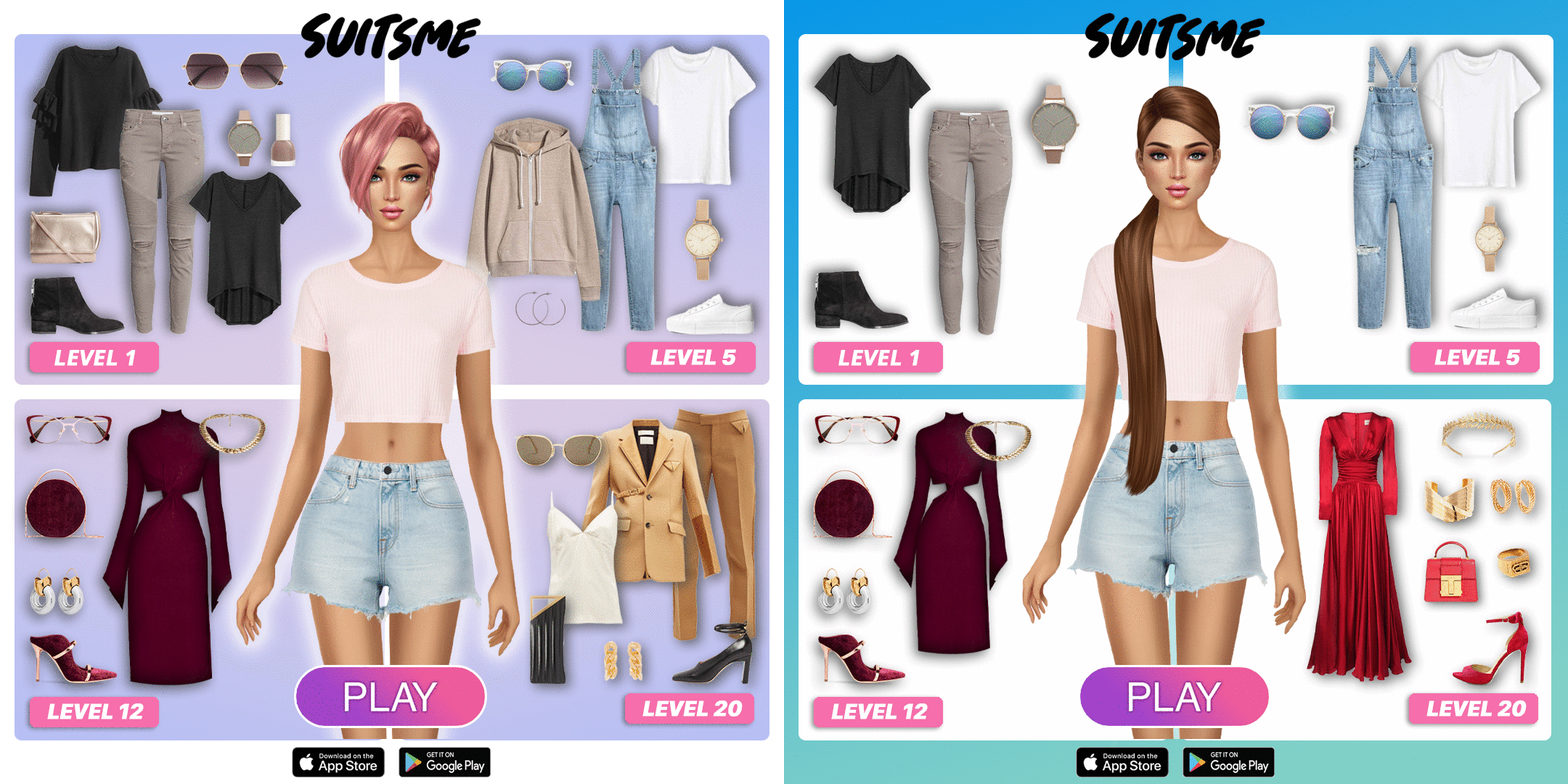
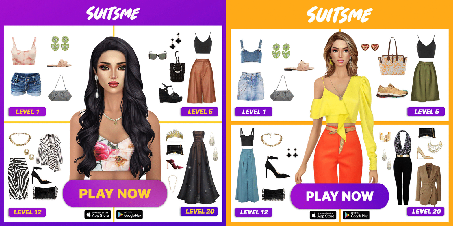
For our tests, we used Facebook as a marketing platform and Android as an app platform. We created a campaign for a wide audience with one ad set and several versions of the creative inside (from three to five). Once we achieve substantial results, we turn off the test.
If a particular creative shows good results on Facebook, it will also likely perform well on other platforms. So do not miss out on a high potential ad by making only one version of it.
My six tips have worked well for our team, but you need to make your own secret sauce. Marketers who achieve positive ROI will tell you there is no single formula for a successful ad. It is about investigating the market, studying your consumer, trying many concepts and triggering user emotions. I hope these six tips guide and help you design high-performing ad creatives.