How Triple-Page Ads Are Delivering a New Creative Experience
Anyone opening a mobile app today can attest to the sheer variety of ad formats. Static ads come in many shapes and sizes, from easily deployable banners to native and interstitial full-screen ads. Then there are standard video ads, rewarded video ads, and, more recently, interactive ads, where you can try out a brief preview of the advertised app.
The reason for so many ad formats is that there’s no clear answer on the most effective format. Depending on the platform or vertical, ad formats can drive higher engagement rates and post different costs per install (CPI). For example, when it comes to gaming, our 2023 Mobile Ad Creative Index found playable ads to be the most cost-effective option for driving installs with a CPI of $1.31. In contrast, playables are the most expensive option for dating and social apps at $3.71, but native ads cost just $0.44.
But now, there is a way to combine the unique elements of multiple ad formats into one highly engaging user experience. That’s the idea behind triple-page ads, which many mobile advertisers rally behind for their higher click-through rates (CTR) and impressions.
What are triple-page ads?

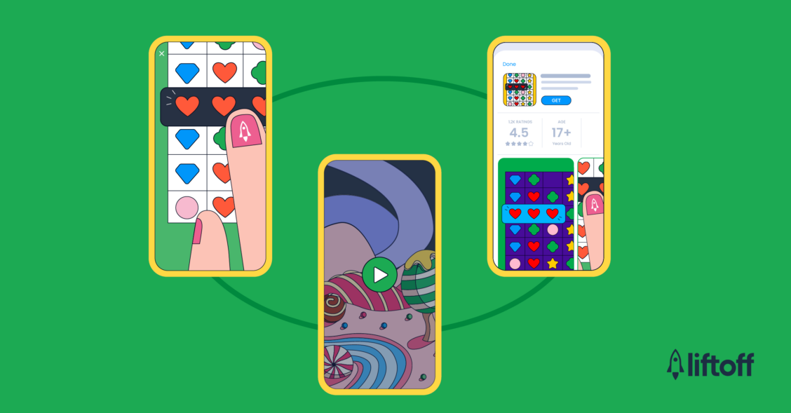
Triple-page ads are creative experiences that give advertisers a way of combining the best aspects of video, static, and interactive (i.e. playable) ads into a single ad impression. As the name suggests, the experience combines three full-screen formats that appear during app transitions—for example, when someone finishes a level in a mobile game or swipes through stories in a news app.
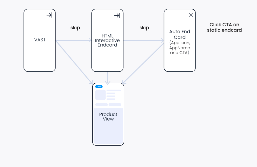
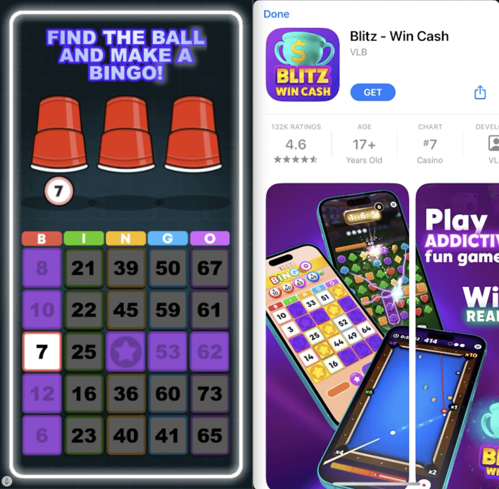
Triple-page ads follow this format. A triple-page ad for a mobile game begins with a short video showing off an action-packed segment. Users can then try the game via a short interactive end card. Once they’ve completed or skipped the playable, a static end card appears with a call to action (CTA) directing them to download the full game.
Why triple-page ads are growing in popularity
Triple-page ads increase the number of opportunities to convert users while providing a more engaging experience. By combining strong branding and a clear CTA with an interactive element, advertisers have more opportunities to showcase creative elements of their app or game.
Combining these gives advertisers the best of all worlds—resulting in higher conversion rates and better CPIs. We reported a 20% increase on average installs per mille (IPM) from triple-page ad experiences compared to traditional formats. Triple-page ads also offer many other additional benefits:
- Our triple-page ads leverage SKStoreProductViewController, a feature on iOS that allows an ad to show a fullscreen view of the product (app) page to a user and install it from there without being redirected to the App Store.
- With three creatives come multiple opportunities for users to engage with an ad. Whenever a user clicks or interacts with an ad, a redirect to the App Store or SKPV (from where they can also download the app) will be triggered.
- Triple-page ads provide more options to showcase high-quality game assets. Compelling static designs, contrasted with content-heavy videos and interactive end cards, also help focus the user and highlight the CTA.
How to get the most from triple-page ad formats in your campaigns

By combining key creative formats and an end card, triple-page ads provide unrivaled user engagement at a low price point. To get the best ROI from this creative experience, mobile marketers must prioritize user experience. For example, triple-page ads should feel seamless. If the transition from the video or playable to a static end card hasn’t been correctly mapped, the experience can feel abrupt.
The static end cards at the end of a triple-page ad experience are automatically generated and use a simple design with a strong focus on CTA. Advertisers can build on this further by using video and playable creatives to highlight the value proposition and captivate audiences. Marketers can also combine triple-page ads with rewarded and interstitial placements to enhance user engagement.
Since the end card is automatically generated using assets from the app store, such as the app icon, advertisers need to ensure the icon is high quality. If not, consider switching it for a limited time during the ad campaign to make it more engaging. Like quality YouTube thumbnails can improve clickthroughs on video content, quality app store icons are an opportunity to attract potential customers.
Finally, as with any ad campaign, the proof is in the data. Experiment with different creative assets to ensure the best results possible. Mobile marketers must be bold in testing different combinations of videos, playable, and end cards. Once they’ve identified what their audiences find the most compelling, the performance will speak for itself.

