7 Tips for a Successful Native Ads Campaign
Native campaigns for mobile are an increasingly popular way of attracting user attention without disrupting the app experience. According to recent research, native ad spend in the US is set to increase by 21% to a value of $57 billion this past year. The global native advertising market is expected to reach $400 billion by 2025. Studies have also found that they can be more successful at driving engagement and combatting advertising fatigue.
So What Are Mobile Native Ads?
Native ads are designed to blend in with surrounding content. Unlike traditional ads, which are easy to skip and can feel intrusive, native ads match as closely as possible the function and style of the platform—be it a game, a news app, or a video-sharing platform. Instead of interrupting the user experience, native ads aim to be part of the look and feel.
Done right, they can be easier to understand, increase brand awareness, and reach users who may be resistant to traditional ads. While the benefits of native campaigns are clear, they can be tricky to pull off.
Creating a Winning Native Campaign
Since native ads need to match a unique app environment, they require closer coordination between publishers and advertisers. For creatives, this means that the design options, layouts, and types of assets they can use will be limited.
UA teams will also need longer to arrive at a strategy that works. Ads may be well-designed, but if they fail to strike a fine balance between achieving the feel and tone of the publisher and attracting user attention, they won’t succeed. UA teams will have to experiment to find a winning combination.
Tips to Level Up Your Native Ads
When you’re designing a native campaign, the fundamentals still apply. As with non-native campaigns, start by getting to know your app and your customer. Figure out who your target audience is, what they read and what they follow. Also, get to know the native environment, how users behave, and what formats are available.
As with all campaigns, set your goals before you start and identify your KPIs. Figure out if you’re optimizing for installs or in-app purchases, what your target CPI is, or if you’re mainly looking to raise brand awareness. Once you’ve set your targets, experiment and analyze your findings. To get you started, here are a few tips for building a successful campaign:
1. Don’t Disrupt the Flow
Remember that you’re aiming to create a smooth UX. The ad should behave like the native elements that surround it. For example, static ads on news apps should have the same font, colors, and style of images as native articles. Designs that look like spam—such as pop-ups—will disrupt the flow of the app, and anything that scans like an ad might be skipped or ignored by the user.
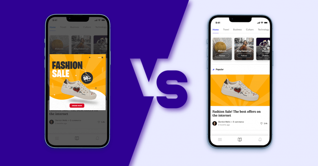
Instead, lean into the experience. For instance, we never show devices or hands holding devices in our ads. Since your user is already on a device, reminding them only breaks the immersion and creates barriers to engagement.
2. Avoid Clickbait
Crucially, native ads should not try to trick the user. Remember that the purpose is not to drive clicks at the cost of building trust. Focus on delivering a clear message with components that work well with each other instead of large, flashy CTAs that force the user to click. Never add more than one CTA—this will only clutter up the design and confuse the users. Give potential customers a clear, compelling message that entices them to learn more.
3. Native Does Not Mean Camouflage
Native campaigns resemble in-app content, but they also have to be attractive and stand out. Don’t forget to apply what you’ve learned about the app vertical from other campaigns.
For instance, we found that when working with social networking or finance apps, highly produced images and stock images tend to do less well than user-generated content or images of UI. It makes sense—potential customers want to see the app validated by their peers, and they want to know what the UI will look like in advance.
4. Take Advantage of the UX & UI of the Native Environment
Appearance matters, but it’s not enough just to mimic the look of native content. Create ads that make clever use of UX. Consider not just what the users see but what their immediate and long-term goals are when using the app.
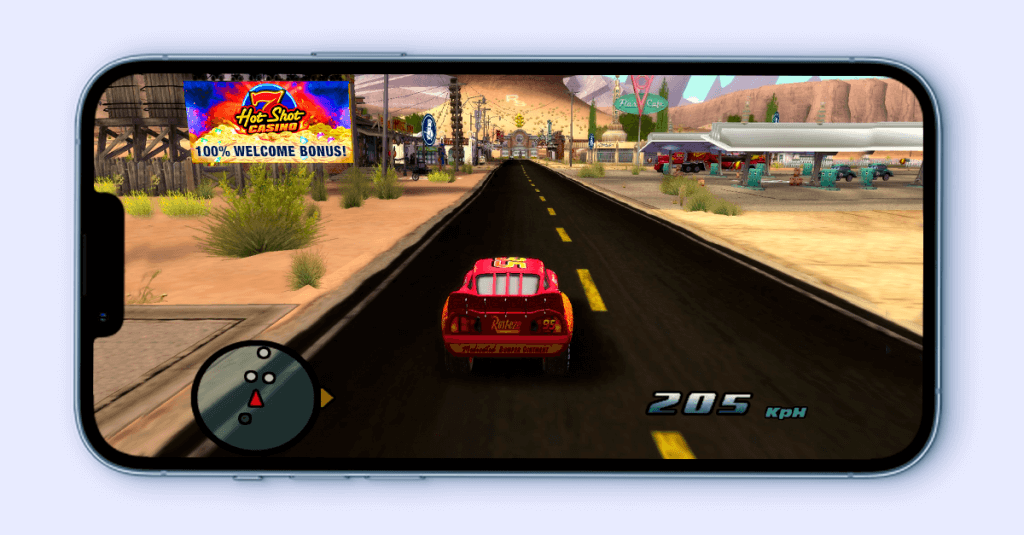
For instance, an ad placed in a gaming environment should speak to what a player might want to do. They might be exploring the terrain or looking to collect a prize. At Liftoff, we work a lot with Social Casino apps, and we have had success with ads that take inspiration from the real-life casino experience. Cashout vouchers, for instance, perform well because they align with a player’s in-app goals.
5. Deliver a Clear Message
With native ads, you have limited assets with which to make an impression. But you still want the user to discover and explore your app. When in doubt, I recommend a simple design that contains a logo, the app icon, the main headline, and a clear CTA. This can accomplish more than a cluttered ad with flashy graphics and images.
It’s important to make sure the message can be understood at a glance. If it’s too complicated, users may skip it or miss-click thinking it’s something else.
6. Make A/B testing easy on yourself
Using only a few design elements has other benefits—it makes A/B testing easier. If it’s a static ad, follow the style cues of the app (the color, the font, the types of images), and if it’s a video, stick closely to the format. When experimenting, only change one element at a time. Once you find a winning combination of assets, use and reuse it.
7. Be data-driven.
Since native ads are designed for a specific environment, it may take longer to figure out what works and what doesn’t. But this doesn’t mean you shouldn’t keep track. When we decide on a winning formula, we always have thousands of install-uplifts to back up our learnings.
Native campaigns are a unique opportunity to leverage the context of the app to draw attention to your ad. That said, the basic approach to creative design and testing is still the same. Experiment widely, track what you do, and you’ll likely find a strategy that works.
Consult our updated 2021 edition of Liftoff’s Ad Creatives Index, which you can download for free to learn more about all types of creative formats. Discover how each creative performs and how you can improve banners, interactive ads, and more. You can also read up on how to optimize video campaigns with lead Ad Creative Producer Thomas Zuko and discover how to run ad creative testing for mobile ads effectively too.
